As a business owner, you should ensure that every interaction a customer has with your company is straightforward and stress-free. It can make a huge difference in how they perceive your business and whether they’ll recommend it to their friends and family.
Here, I’ll provide you with six tips that will help you to ensure your online customers always have a positive experience when shopping with you.
Make Sure Your Site Is Incredibly Easy to Use and Navigate

Customers don’t want to spend their precious time figuring out how your website works, so you want to make sure it’s straightforward to use and navigate. If it’s difficult to find what someone needs, they won’t stay long enough to make a purchase. A positive user experience can also improve your website’s SEO because search engines only want to recommend sites that have made other visitors happy.
To ensure you are offering a good shopping experience, you want your site to have a quick loading speed. You should also provide intuitive navigation, designing your website to know where to find the information they need. For example, people usually expect the navigation menu to be on the top right of a page and often scroll to the footer to find your “contact us” information.
Also, consider adding a search bar to help people find whatever they need on your website. And don’t forget to design your site with accessibility in mind. You can do this by using descriptive alt text for your images and making sure you use short headers that give meaning and structure to your content, which is especially important for screen readers.
Finally, you should design your website according to the type of business you run and who you’re looking to attract. Some customers might want to browse by types of products or by the kind of person they are (e.g., an e-commerce site could have “for men” and “for women” sections). If you need assistance with this, you can always contact professionals, such as this Ottawa SEO agency.
Create Content That Supports Your Customers in Making the Best Purchase
You want to do everything you can to help your customers make the best shopping decisions to suit their needs. Doing so will save your customer service team time, reduce the need for refunds, and provide you with better reviews. One of the best ways to do this is with content that aims to help customers with their buying decisions. Buying guides and comparison pieces are excellent for this.
Let’s check out some examples of content that aims to help people with their shopping decisions so that you can take some inspiration from them. SocialPilot is a company that provides social media marketing tools for businesses. Their website has a blog post that talks about 8 Facebook advertising tools that can save people time and money in 2021.
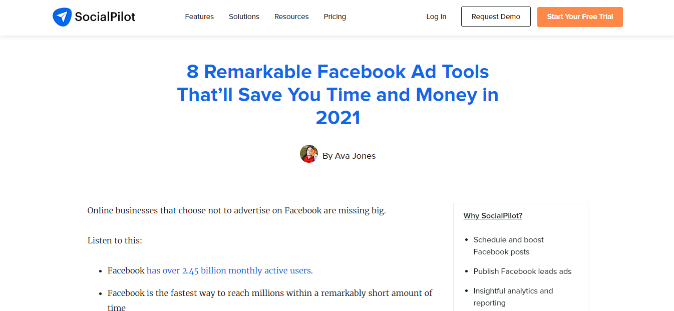
As a social media marketing company, they understand that their target audience may be at the stage where they find it hard to decide what tool to use. So, to make it easier, they have created this detailed comparison post listing eight different Facebook ad tools, their features, pros, cons, and reviews from people who have used these tools.
Moreover, business owners that are looking to create comparison pieces like this focus on highlighting the differences between each product so customers can have unfiltered access to the best possible choices. Highlighting differences makes it easier for their audience to have all the necessary information to make this decision. And it also positions SocialPilot as a company that wants the best for its customers.
Our following example comes from Best Value Schools, an online resource for people who want to advance their education. They have a detailed blog post on the best 46 Masters in Psychology Programs of 2021. This post compares 46 schools and highlights their locations, subjects offered, research focus, as well as tuition costs.

They understand that students are inundated by the many options available when selecting a study program, so they have included all the details that can help them make this decision. You can replicate this for your audience by taking the time to do the research and outlining all of the different options your customers have.
The most important thing is that they make a purchase or decision they’re happy with, so you want to present all of the information they’ll need to do this. Also, check out this example from Chanty, a communication software that aids team collaboration. To save their customers time, they have created a product guide on five video calling apps that people can use to stay connected with their team.
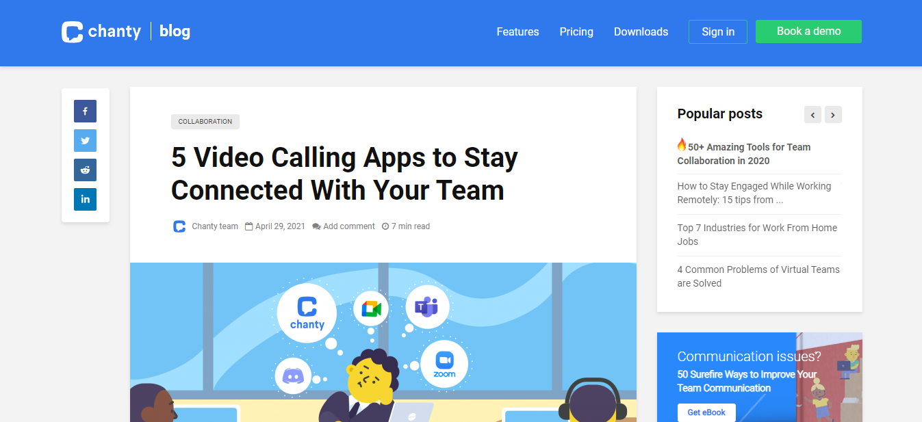
They’ve gone through video calling applications like Google Meet, Zoom, Discord, and Microsoft Teams, highlighted their features and benefits, and also included the pricing plan for each of them. They’ve also included their product in the mix without being overly biased, showing that they support whatever decision their customers make.
As a business owner, you want to emulate this because it shows customers that they are your number one priority, and it also helps to build trust and brand loyalty.
Make It Incredibly Easy for Customers to Get in Touch
People that visit your website may have questions or concerns about your products. To help put their minds at ease and move them through the sales funnel, you’ll want to make it as easy as possible for them to contact you. Different people will want to contact you in different ways, so it’s a good idea to give them several options, such as phone, live messaging, social media, or email.
Here’s an example of a website that offers excellent communication options. BrightLocal is a marketing platform that helps users with their local SEO efforts. A simple form for people to fill in on their contact page if they want to get in touch. They’ve created the form so that people can get personalized options to choose from depending on whether they are new visitors or returning customers. They also have a live support option for people who want to get immediate answers to their questions.
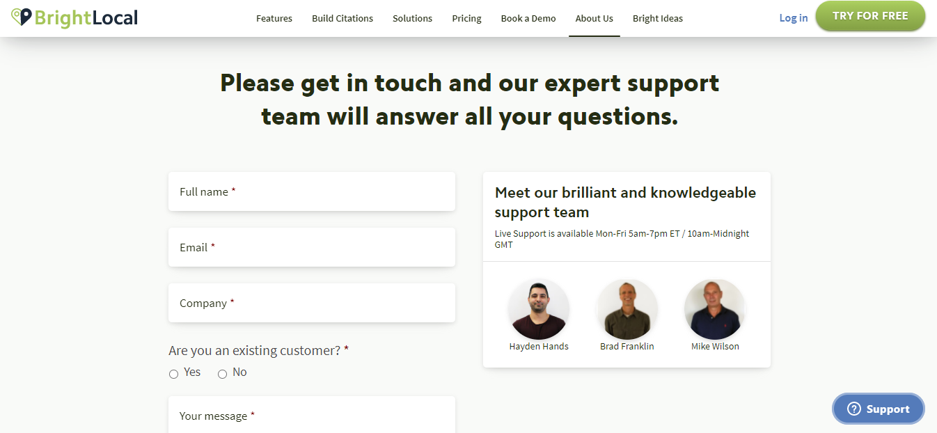
In addition, they’ve included multiple options to make it easier for customers to reach them. And, if you look to the right, you’ll see that they’ve added a personal touch to their contact page by including pictures of the people on their support team. Pictures are a great way to make customers feel like real people are attending to them and not just automated machines taking their calls.
You can also replicate this for your business by including nice pictures of your customer service team to help customers understand who they are talking to.
Ensure Your Site Provides a Quick and Easy Checkout Process
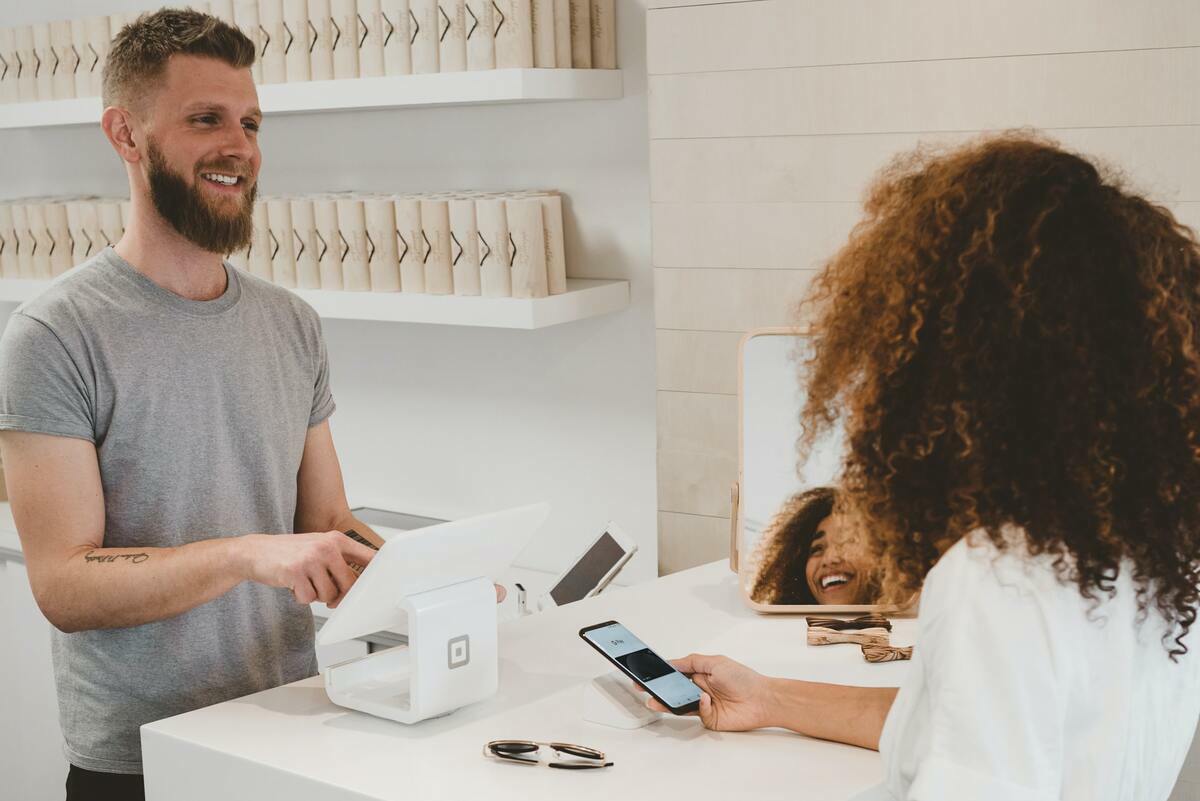
A poor checkout experience is one of the biggest reasons shoppers abandon their carts. A study from Baymard Institute showed that 18% of online shoppers in the United States left their orders in the 3rd quarter of 2020 because the checkout process was too long or complicated.
To ensure that your website offers an easy checkout process, offer a guest checkout option where you give customers the chance of checking out without requiring them to sign up first. The effectiveness of this is corroborated by a study from SaleCycle, which found that 25% of customers have abandoned their carts after being asked to set up an account first. So, by offering guest checkout options, you’ll speed up the process and have a greater chance of converting more customers.
Another tip is to create progress indicators that update customers about what stage they’re at in the checkout process and show them how much time is left to complete the purchase. Doing so helps reassure them that they won’t have to spend too much time on your site. You should also make sure there are multiple payment options for debit cards, credit cards, PayPal, and more.
Publish Reviews to Make New Customers Feel Comfortable
Word-of-mouth recommendations are compelling, and you can replicate their effect by adding customer reviews to your site. Reviews will help new customers feel more confident when buying from you, and they can also help them set their expectations on what they’ll receive when they buy from you.
Let’s take a look at some different examples of how websites have incorporated reviews into their pages so you can get some inspiration. A Gift Personalized, for instance, is an eCommerce site that sells personalized and engraved custom gifts for different occasions like Father’s Day, graduations, and weddings. Their website has a section titled ‘our customers love us’ where they display various reviews from previous customers.
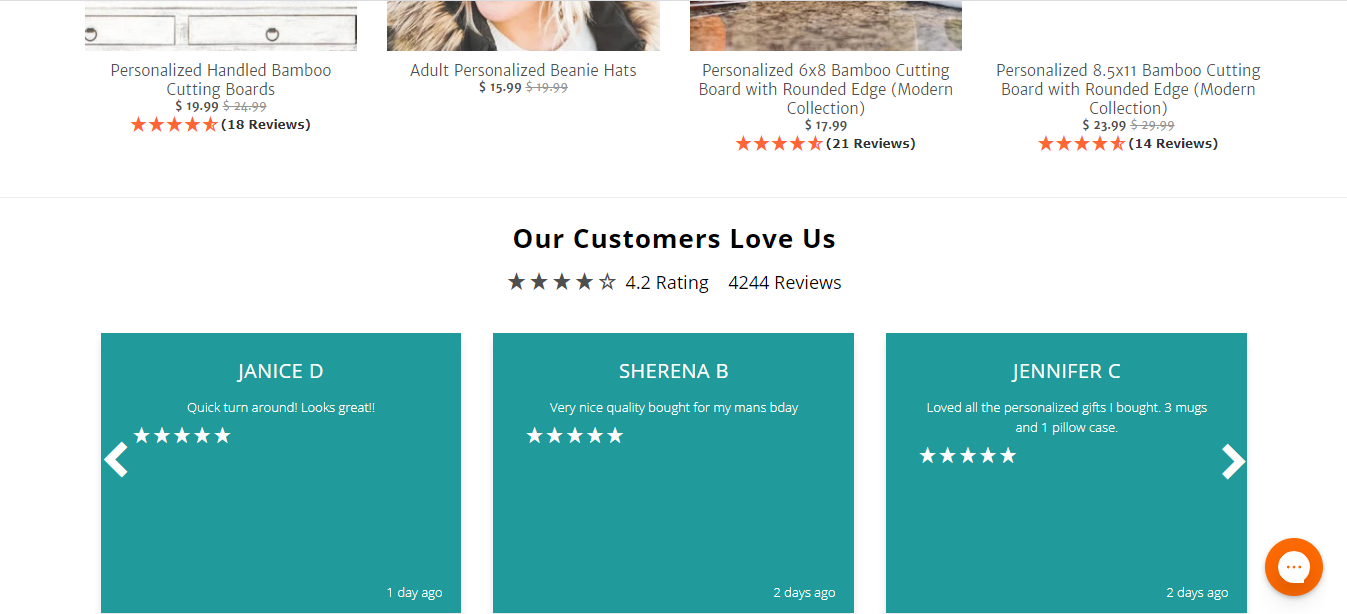
They have more than 4,000 reviews and a 4.2-star rating overall. These are real-life testimonials given by customers who highlight their experience with this brand. With these reviews, potential customers are bound to feel more comfortable buying from this brand. Also, every item on the website has its reviews and star rating, making it easier for prospective customers to decide which item they want to get. All of these recommendations come together to create a great shopping experience for any new visitor. It also inspires confidence in this company, thus leading to more sales for them.
Regardless of the type of website you own, including reviews on your website is an excellent way of making your prospective customers feel like they can trust your brand. You can replicate this example by having a dedicated section or adding reviews to individual products. Alternatively, you can have it both ways, just like A Gift Personalized.
Another great example is Glossier, a company that sells makeup and beauty products. They have a webpage called “shop the look,” where they have included images of customers who have used their products. These are real-life images of everyday people showing other customers how these products will look when applied.
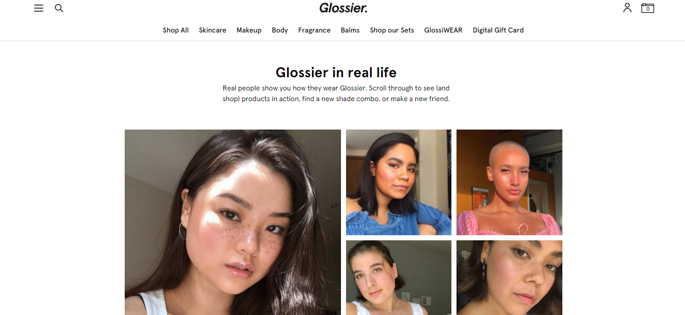
For Glossier, this is a very effective way of providing their customers with a great shopping experience without them having to try on these products at a physical store. It also assures people that other people have used these products and feel confident about them.
This tactic can work incredibly well for cosmetic or fashion businesses. But, even if you don’t own one, you can still take notes from this brand by including user-generated content like this one on your website for prospective customers to look through.
Use Interactive Elements to Help Customers Understand Your Products or Services
Adding interactive elements to your product or service pages can help customers better understand what you sell. They are also great for capturing the attention of your users and creating a personalized experience. There are different examples of interactive elements you can include on your website.
You could create an interactive calculator that lets your customers input specific figures and work out how much they can expect to spend with you. Also, you can use virtual try-on features that can engage users and increase the time they spend on your website. This kind of tool is created to enable customers to virtually try out a product and see how it will look on them if they purchase it.
Quizzes are also a significant interactive element. You can use them to ask your audience short and specific questions that help you provide personalized services for them. Most quizzes can also be used to entertain or find out how much your customers know about your products.
Here are some examples of companies using interactive elements to help customers understand their products or services. iCASH, a financial lending company, has incorporated an interactive calculator into its service page for payday loans in Canada. The tool helps their audience select how much they wish to borrow and how many repayments they can make.

So, when customers land on their site, they don’t have to register before discovering if they are even eligible for their loan plans. Also, for customers who are confused about its services, using this calculator will help them quickly understand how it works.
If you want to replicate this for your website, you can also create an interactive calculator that will give information specific to the kind of services you offer. You’ll also want to make sure the design is responsive and straightforward, as something too complex can confuse prospects and cause you to lose possible customers.
You should also check out Looka, an online logo maker that uses an interactive quiz to ask business owners a series of questions to help get an idea of what their logos should look like before assisting them in designing them.
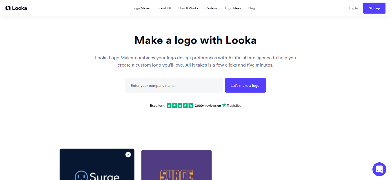
Visitors are prompted first to input their business name and industry. They’re then presented with a variety of logos that have been generated based on the data inputted. Then, they are asked to choose logos they like from some examples and pick out colors, slogans, or symbols that best represent their brand. From here, customers can begin to customize the logo they prefer.
Customizing is such a practical element because it helps customers understand how their logos are created. It allows them to try out the product without making a financial commitment. And, once people see how good the results are, it can also help to increase the number of sales for Looka.
You can also make an effort to introduce quizzes like this for your website, as it can be an excellent way for you to find out your customers’ preferences and provide them with a more customized experience.
And then, we have NYX cosmetics, a professional makeup, and beauty brand. Their website has included a ‘try it on‘ feature where customers can virtually try on different products like eye shadows, lipsticks, lip gloss, mascaras, and more to see how the different shades would look on their skin. To do this, people can use their live camera, upload a picture, or use a model. They can then select different products to visualize how these will look in real life.
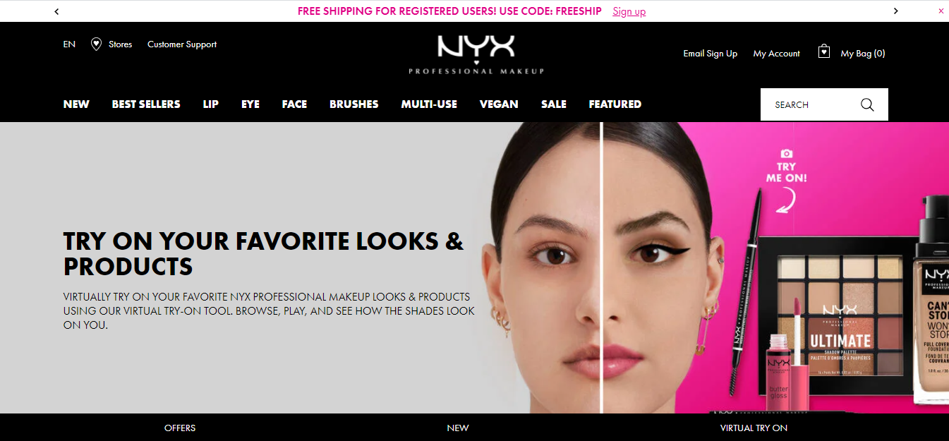
One of the problems with shopping online for makeup or beauty products is that customers cannot see how they will look. NYX Cosmetics has effectively gotten rid of this problem by creating an interactive element to replicate the in-store shopping experience.
Summary
Customers today have many options available to them and more places to shop than ever before. To avoid losing them to your competitors, you want to ensure you provide them with the best possible shopping experience.
Some of the steps you can take include designing an easy-to-navigate site, creating content that helps customers make the best purchasing decisions, and publishing reviews that make new customers feel comfortable.
—
Author bio & headshot:
Adam Steele is COO and co-founder of Loganix, an SEO fulfillment partner for digital marketing agencies and professionals. The company provides the SEO services that businesses need to grow and achieve their goals. If you enjoyed this article, you could find more SEO guides and templates on the Loganix blog.

