
Modern technology has allowed us unadulterated access to personal data like never before. But, of course, it would be best to take advantage of this opportunity and always make data-based decisions whenever it matters.
But the secret in being able to do so lies in our ability to interpret our data. While talented individuals can make sense of it in its raw form, tools that can perform data visualization – such as chart or graph makers – are of immense help in this regard.
So let’s run through why and how you can get started on that.
It All Begins With a Graph Generator

Graphs fall under data visualization, which is defined as the graphical representation of information. It’s a key method in helping us create a clear sense of the data we have to interpret.
Thus, visual context is really important, as that allows our minds to naturally comprehend the results of the data we’re trying to observe. By locating trends, patterns, or even outliers within our data, we can take that and turn it into a key insight, which may or may not be actionable but useful all the same.
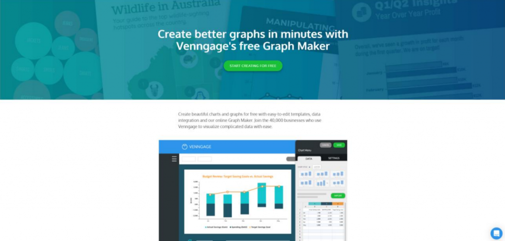
That said, there are many free graph generators out there that can help you tackle the more complex aspect of data visualization design so you can reach these results. Websites like Venngage, Canva, or Visme are prime examples of great online data visualization tools that don’t require much artistic input from their users.
They all function similarly: these sites are essentially online photo editing tools with a huge library of premade templates available for use. Users then take these templates and open them up using an in-browser interface, made specifically so that all the editing can be done through clicking specific elements and modifying their data.
But it can be hard to imagine what it’s like without seeing it first hand. So let’s use Venngage as an example and run through the basics of creating a graph or chart within it.
Using a Free Graph Generator (Like Venngage)
You can begin creating your graph by going to Venngage and logging in, which is found in the upper right corner. Don’t worry if you don’t have an account yet; creating one is free.
Up next, you’ll want to navigate to the templates section. By default, it will take you to the recommended category where all the top templates reside. However, should you wish to explore or if you’re looking for something more specific, then hover to the left menu and click on whatever category you think best suits your needs.
Because Venngage is aimed more towards making visual communications easier in a business setting, it helps to think with that approach in mind. Once you’ve chosen your template, click create. That should bring you to the editing page:
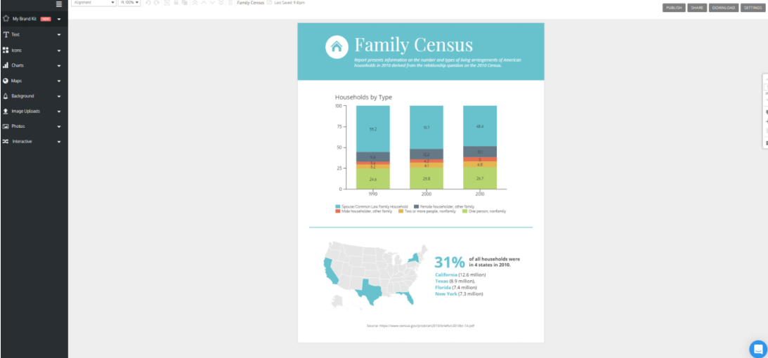
You can then click on any of the elements you can see within the image and directly edit it. Make sure to input the appropriate data into your chart.
That’s not all you can do. To the left is an expandable dropdown menu containing even more elements you could incorporate into your graph to make it more eye-catching and aligned with whatever theme you’re going for.
This part of customization is essential for creating a cohesive and engaging story about your data, so don’t be afraid to take some time and tailor your graph according to your visual requirements. Once you’re done, you can then head over to the upper right corner of the editing area, where you can either publish, share, or download your completed work.
That’s it – you’ve created your first graph.
As mentioned before, other websites like Canva and Visme work similarly, so should you choose to go with those platforms, you can still take this guide’s basic steps and apply them there. However, there are other solutions for those who don’t want to fiddle with any design aspect.
Is There An Automatic Online Graph Generator?
While these tools are great for those who want to have a hand in how their graphs look, some want pure utility. No fuss, no muss. In truth, graph makers don’t have to be complex or even eye-catching. At the most basic level, they simply have to be clear and cohesive, and that’s what Adobe Spark offers: a graph maker without bells and whistles.
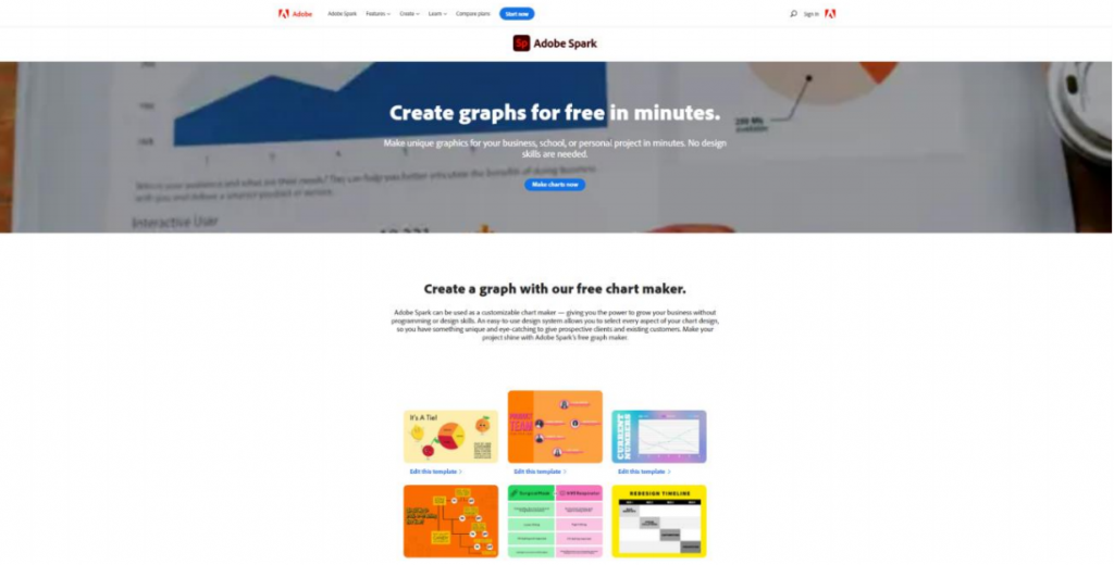
Using it is simple. Go to Adobe Spark’s page and click the button that says “make charts now.” After that, you’ll be taken to the tool instantly.
Now it’s all a matter of inputting your data within the blanks to the left. You can then customize the basic look, colors, and type of your graph within the options. As shown in the photo below, there are two tabs, and they’re fairly straightforward.
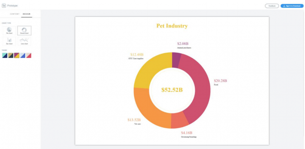
The content tab is where you input your information, while the design tab is where your options for personalization are available. Fiddle with these as needed, and when you’re done, sign in to download your image. If you don’t have an Adobe account, you also have the option of screenshotting it instead.
What If I Want To Make Charts From Scratch?
Designers at heart who want to build their graphs from the ground up have many options at their fingertips, some of the most common being the Adobe Suite, Microsoft Excel, Corel Draw, or GIMP. Excel charts are the most basic way to visualise data. The one we recommend the most out of that list is GIMP because it’s completely free. Those who want to learn how to use it can use this guide.
Of course, there are also online alternatives, the best one being Photopea. It’s a close all-online version of Adobe Photoshop that doesn’t come with a hefty subscription fee. You can learn more about it here. These programs are fantastic for image creation and will allow you full freedom in how you want to create your chart, with the given caveat that you will have to start from a blank slate.
Either way, there are a lot of ways to create charts. It all depends on your needs and how much work you’re willing to put into the design. So feel free to browse all these options and pick your favorite. Happy designing!